Writer, Tutor, Mentor | Flash Fiction, Short Stories, Novels, Betwixt and Between.

Tag: art

Tarquinius W. Peterson’s Fantastical Guide to the World of Art: The Scream by Edvard Munch

Welcome to Tarquinius W. Peterson’s Fantastical Guide to the World of Art.

This week we are uncovering …

The Scream by Edvard Munch, 1893 - Nasjonalgalleriet
The Scream by Edvard Munch, 1893

Everyone knows this artwork, but that’s not surprising, as several, several copies exist today. By copies, I mean versions. Since version 1.0 Mr Munch endeavoured, over several decades—even centuries—to exploit the world’s art market in producing upgrades and variations. Versions 1.1 to 1.3 exist, along with an offshoot version 2.0 and then moving on to version 3.0, which became, and still is, the most successful icon of modern art ever, period.

How did this Norwegian expressionist son of priest takeover the world? Tarquinius W. will explain.

With a catalogue of versions flooding the market, bent on world domination, we need to examine each on individual terms. But, where to be begin?

Firstly, I apologise to the other artists, sculptors and creators of various art forms whom I have or will put under the Peterson spotlight and magnifying glass, because as a general rule, I scrutinise individual pieces. In greedy Mr Muncher’s abuse of galleries and critics like myself, Tarquinius W. Peterson, he inadvertently, or deliberately as is more likely, created numerous variations—the idea revisited later by American pop artist Andrew Warhola, and manipulated, although not as successful as Ed.

So, we start with versions 1.0 through to 1.3 of The Scream. Or is it The Scream?

Over the years, confusion with reference to the artwork’s title prevails. Those uneducated, refer to this piece as The Cry (an alternate translation from the Norwegian word: shrik, which means scream, or cry), but a handful of lazy critics use the title The Shriek (which comes from not translating the Norwegian word: shrik). It doesn’t stop there! Edvard Munch produced and exhibited most of his work in Germany, and his version 2.0 below carries the words Das Geschrei which, in Deutsche, translates to the above words, and: yell, clamour, wail, shout, or howl! For clarity, Tarquin chooses The Scream.

An observation we note straight away is that Eddie the Artist is a staunch environmentalist. This began when an online purchase of a multipack of canvases arrived from Amazon. Munch, annoyed by the volume of unnecessary packaging material, became infatuated with the texture and colour of the brown corrugated cardboard, so much so, he stored the canvases, kept the packaging and used it as the base substrate for version 1 editions of the artwork, as follows …


Version 1.0
Skrik 1893
The Scream [1893]: pastel on cardboard (see).
Very sketchy pastel, although Munch didn’t deviate from this composition to those of his oils, so he must have gone with his first idea—not much development IMHO.
Note: Are the characters in the background impaled in, or on, the railings, producing cause for the scream?


Version 1.1
The Scream by Edvard Munch, 1893 - Nasjonalgalleriet
The Scream [1893]: oil, tempera (the technique of mixing paint with egg yolk to form a smelly watery miscible emulsion, yeah, weird) and pastel (again) on cardboard.
Everyone’s seen this popular version which hangs in Oslo’s National Gallery and copied in most reference books.
Note: The head severed from one of the background characters could be a screaming cause.


Version 1.2
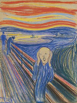
The Scream Pastel
The Scream [1895]: pastel on cardboard (again, see).
Created two years after 1.1, the only known version outside Norway, and sold at a bigly price in 2012. Near to US$120 million to be inexact and to a private collection, but not that private, a well known rich-guy called Leon Black—’We know where you live, Leon!’
Note: Only a single boat sails on the sea in this version and this could be the catalyst for a scream due to the horror of a sunken vessel.


Version 1.3
Edvard Munch - The Scream - Google Art Project
The Scream [1910]: tempera on (more) cardboard.
Yet another one, and probable grounds for exploitation of the market. At this time, it is certain that he couldn’t dislodge the disturbed image from of his head. Also, with only tempera, it’s an eggy version. It is curious that someone liked the oeuffy aroma of this painting: nicked from Munch Museum in 2004 and recovered in 2006 with bite marks.
Note: It is clear in this version that a scream emanated because the screamer lost both his or her eyes.


Version 1.4—A T.W.P. Exclusive

Rumoured to exist, is a version 1.4, but the whereabouts unknown. This is because during WW2 the then owner, a clever German Jewish gentleman, hide it from the scumbag Nazi’s and Hitler—who once said of Munch and his arty pals: “… (they) art-stutterers can return to the caves of their ancestors and there can apply their primitive international scratching.”—fascist.

It is within the bounds of practicability therefore, that hidden away in a forgotten dark, damp cave at the edge of a Norwegian fjord, a missing 1.4 lives disguised in discarded cardboard packaging washed-up on the beach.


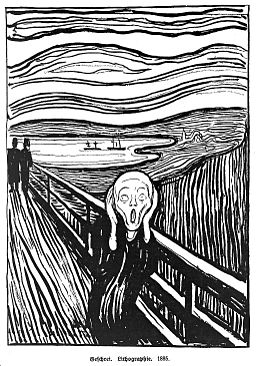
Version 2.0
"The scream". Wellcome L0011212

The Scream [1895]: lithograph.
So, following on the great success of his return to pastel in version 1.2, Edvard turned thoughts to “limited edition” print runs on litho. 45 rare prints, made before the printer rejigged the stone plate, are catching huge sums on eBay. The most sort after are the ultra-rare hand-coloured editions by Eddie, I recommend checking-out the local Oslo car-boots when visiting.
Note: The screaming person in this work exhibits a sideways glance to an action the other figures may have done.


Version 3.0

Edvard Munchenbaby decided he’d had enough of producing rarities for rich art collectors, so in answer to increasing globalisation he worked on a cheaper mass-market edition: his “Face Screaming in Fear” emoji.

Designed to resemble a digital version of The Scream and available world-wide as Unicode emoji rendering U+1F631:

 ?

Disguised as a piddly commission of US$0.005 for each use, this product placement has grown to multi-million dollar royalties for Munch’s estate, and still grows. The fee generates every time someone sends a Screaming Face text, or email, or renders this blog page to read it—which comes to at least a US$0.015 commission alone.


Influence

Money aside, a few questions that come to mind—other than, was Eddivard Munch a globalisation fundamentalist, or just a cool brand icon builder?

What influenced The Scream?

Who was the Screamer?

Why, in his return to the pastel colours in version 1.2, does the unobserved figure on the left appear to be throwing-up over the handrail? Is it a shock reaction inline with the screamer’s scream, or just more realism than shown in the kiddy-style faces and silly hats in version 1.0?

Tarquinius, author of the Fantastical Guide, can let you in on a recent discovery with regarding the composition, and to the fellow in the foreground who influenced this great representation of expressionism. After a long, long, and extensive research of waterways, lakes and oceans in and around Scandinavia, Tarquinius can reveal that a relevant event occurred at the Munch’s mansion in the city of Christiania (now named Oslo), not long after moving to their new house. The Munch’s didn’t have much, the house was a step-up from the farmhouse where they lived before—the birth place of Munch—and his father’s pious Lutheran ways lead to a simple life.

So, The Incident!

When he was only four-years-old Edvard’s mother, suffering the onset of TB, crashed their horse-drawn buggy into a tree trying to negotiate through their garden gate. Edvard, thrown from the horsey jalopy into the tree, suffered head trauma. His father went ballistic with rage, although abstained from blasphemous comments, berating mother and son. Edvard’s Pops was not the influence for screamer. Edvard, the self-diagnosed madman, blamed his father for his insane inheritance.

The shock of the buggy incident effected his mother and hastened her consumption. Although, combined effects of pain, shock and horsey embarrassment on his mother’s face did not coerce Munch’s artistic talent in determining The Scream‘s facial expression either. Neither, while he enjoyed self-portraiture, did Eddie’s own saddened reflection following the death of his mother help with the haunting shrieking cryer.

T.W. Peterson deduces that no single human emotion, or mixture of emotions foretold in individual family faces aided the painting’s grimace. Instead, Eddie Munchie—not to be confused with the original 1957 Munchie sweets, produced by English company Macintosh (not the Swiss Nestlé copies)—was himself possessed my the local vicinity where the accident took place.

In a timeline, far into the future, one copy of the The Scream, pursued by timelord, Sylvester McCoy, hangs on a dust planet called Duchamp 331. And yes, the famous Frenchman manufactured the Art Gallery and Showroom planet, but we’ll cover Marcel Duchamp, his impromptu meeting with our Eddy Munchy, and his planet building abilities in another post.

When Mrs Munch crashed into the tree, Edvard inhaled dust from under the tree’s bark, which transformed in the young child’s brain to the Warp Core: an alien fighting force; and only defeater of the unstoppable, biologically-engineered killers: the Krill (ask a Whovian for further information).

The route of Munch’s mental energy and tormented psychological thoughts, according to the seventh Doctor, lay within this Warp Core and exerted a powerful influence on the artist. Driven by decade-long battles with his brain, Munch sort to exorcise the alien into The Scream pastel dust, and bound it to the cardboard’s corrugation behind the howling screamer.

This alternate Munchian-influenced timeframe and sequence of spacial events must not be confused with the The Silence; another alien race, whom resemble incarnations of Edvard’s screaming creature. These aliens only look similar and, as their name suggests, they don’t yell or howl. Their bizarre characteristic is humans are not conscious of their existence, only a “subconscious awareness”, the moment a Silent turns their back humans completely forget them. In the future, the eleventh doctor, Matt Smith, is foreseen dying by a Silent, further into the future. To expand more on this, I need a study course on quantum physics, plus Dr Who’s not human, and I can’t get my head around such a scenario; I’m an art critic not a rocket-scientist.

So, the real concept for The Scream was not weird looking aliens or the artist’s mind-blowing mental disorder, but a beech tree. This Warp-Core-alien-thing tried to transmogrify Mrs Munch, causing her to crash the family cart, but then changed its mind when Edvard bumped into the tree trunk releasing bark and the dust.

On my visit to Oslo, investigating those pertinent and connected events that took place at end of the nineteenth century, I, Tarquinius W. Peterson found the source. The Screaming Tree!

The Screaming tree in Oslo, source of The Scream by Edvard Munch.


More

Another semi-interesting development of The Scream—although not very interesting—was an upload by a teenage hacker to the graphics server of US Government Department of Energy, which appeared as a background-image on every webpage.

The unknown hacker stated his growing concern with an increasing existence of radioactive waste, turning up as utilitarian barbecue stands at highway rest stops and countryside picnic areas. Tarquinius W. Peterson chooses not to show the non-language-specific image, because, well, frankly it’s rubbish, but if you are interested, it’s <here>.
Tarquinius W. Peterson’s Fantastical Guide to: The Last Supper by Leonardo da Vinci

Welcome, once again, to Tarquinius W. Peterson’s Fantastical Guide to the World of Art.

This week we are uncovering …

The Last Supper

The Last Supper by Leonardo Da Vinci 1495-1498

One of the most amazing frescoes ever, clings to the wall of Milan’s Church and Convent of Santa Maria delle Grazie. The original monastery, built for Dominican Monks over six-hundred years ago, includes a large refectory for dining. Leonardo Da Vinci, a successful street artist of the time, broke in to the monastery, just after its completion, and daubed graffiti into the fresh plaster to one end of the monk’s dining room.

Monks attending a late night prayer session dedicated to patron Saint Augustine of Hippo caught Leonardo multi-coloured handed. The penance given to Da Vinci included painting a food themed mural over his “Leonardo era qui!” tag.

Such it is, The Last Supper is old. We can see thus in the aged quality of the plaster, but this is not strictly a true account. Put simply, in creating the original artwork, Leon–as I prefer to call him–blended the composition through clouds of smoke and cheap stucco.

To establish a painting of such realism, Leon, according to an entry in his diary, created a live smokey ‘tabernacle’ atmosphere. The last supper took place around the Easter holiday and as we know it can be cold that time of year. Two other facts to note: open fires were fashionable in this period, fresh wood has tendency to smoke. With the dry wood burnt during the winter, damp wood produced thick smoke and drew several of the disciples to complain about the smokey stench of their togas during the sitting.

The green wood became a problem as painting proceeded, the more wood burnt, the greener the stockpile became, the smokier the atmosphere.

Being well known in science and technology circles, Da Vinci was a skilled inventor and creator of wizard-like creative inventions; the helicopter for example. Sketches of Leon’s copter are found all over the web, what isn’t realised is why it exists.

With the smoke getting out of control, hams and cheeses underwent a second process of smoking in the refectory. De Vinci required an extractor fan. One afternoon, following a particularly smokey session, the artist, painter, inventor, scientist, God-fearing man, disappeared into a local olive grove, only to reappear with his whirly “aerial screw” fan, which he paid a servant to fly around the dining room to keep the smoke away from the disciples.

Before we look in further detail, can I just confirm that the arched shape to the centre beneath the table is a stone arch to a store at the back of the refectory. It is not the top of the painter’s chair, as those less-educated have maintained.

Critic Jean-Luc Cliffman once incorrectly stated that the painter, Leon obv’s, included the back of his own chair, because when he took a pinhole camera picture for reference and stood behind it to get the whole table in the picture, he forgot to move his chair. Naturally, Jesus wasn’t too pleased because the chair masked his feet, and he took a pedicure especially for the painting.

Painting alfresco on a wall is never an easy task, however, this was an inside fresco, but just as hard. Imagine painting a monster picture in a refectory with bench seating and long tables in the way, not to mention tempting food aromas.

With these complexities considered, it is no surprise Leon d’Vee–as I now prefer to call him–misjudged the composition height. As a result the tablecloth draped lower than the apex of the door archway. A sketch, added to the indented archway panel, portrayed Jesus’s feet and ankles, but the appendages appeared too distorted from the best seats in the feasting congregation, and later omitted. Jesus mouthed obscenities, following the absence of his freshly pedicured tootsies. Mary of Bethany, pissed-off too, hurled abuse as she’d spent that morning polishing Jesus’s nails with expensive nard.

The archway is still in existence, but the doorway remains blocked-up, under order of a past abbot following one Christmas (see below for more fantastical art guidance). The door lead to a cellar where a small sect of silent monks attended to brewing the monastery’s own brand grappa. It is believed distilling equipment sits gathering dust in the sealed chamber.

The importance of alcohol to the celibate monks, lead to the survival of Leonardo’s masterpiece. In protecting the house Grappa, the cellar and wall above were reinforced to deter looters. Chemical fumes from the distilling process permeated the low-grade plaster too, forming a protective layer. In August 1943, an Anglo-American bomb landed on the Refectory destroying all but the rear frescoed distillery entrance wall.

A UNESCO World Heritage site, monastery church and convent of Santa Maria delle Grazie, owned by Roman Catholic monks. One Christmas Day, several centuries ago, these same monks, became embroiled in an almighty food fight. Consequence of said food fight resulted in the deformation of The Last Supper, engraining gravy, cranberry sauce, and brandy butter into the fresco; adding to its misty quality. Needless to state the abbot was unpleased and put a stop to Christmas dinners in the Refectory. All religious dining celebration now takes place in Carluccios, in Milan’s City centre.

Returning to the world famous wall painting we note Jesus in the centre of the table with six of his disciples to either side. These sixes, split into groups of three. Not the usual row of thirteen forward-facing diners. Earlier painters assembled the disciples regimentally, Leon d’Vee chose a new way to represent the well-known supper and broke a relaxed real life rendition of restaurant dining with drama.

Leftover bread and crackers from the cheese board scatter the table as the gathering awaits coffee (thick Arabian type, not your oat-milk latte). Many believe, as Leon intimated to the Dominicans, that the Last Supper painting depicts the moment after Jesus told his disciples one of them would betray him. In reality, the scene shows the mayhem following Jesus announcing that he’d already paid the bill with his Amex, on the quiet, when he last went to the loo.

The disciples, annoyed that once again their messiah had beaten them to it, just because daddy is all-seeing and gave his son the nod when it’s the best time to pay unseen. A furious St Peter is shouting in the ear of St John, above the noise of the ruckus, and pushing Judas Iscariot aside. It had long been noted that Judas was a skinflint and never put his hand in his pocket for anybody. Whilst his fellow apostles are arguing over Jesus’s generosity the stingy Iscariot performs a sleight of fingers grab at the Tyrian silver shekels on the tipping plate. The nonchalant Judas catches the eye of Jesus which influences the prophet’s later speech to the twelve men.

“… the one who has dipped his hand into the tips bowl with me will betray me …”

Other points to note in the painting is Da Vinci’s skills of perspective. Blacked out windows to both side walls and intricate checkered ceiling are in perfect alignment with the vanishing point of the refectory when seated at the head of the centre table, a place reserved for the abbot. On my last visit, whilst enjoying a rather splendid ciborium of cracker breads and cheese, I observed these pleasing lines and angles. Sadly, I’ve no selfie of this, as photography is forbidden in the convent’s refectory (even for Tarquinius W. Peterson), so you’ll have to take my word for it.

Leonardo was also a stickler for health and safety detail; seen by the inclusion of the white alarm box featured to the left of the rear fire door. This door often remained open, propped by several empty wine pitchers, to clear the atmospheric green wood smoke.

Tarquinius W. Peterson’s Fantastical Guide to: Nighthawks by Edward Hopper

Welcome to Tarquinius W. Peterson’s Fantastical Guide to the World of Art.

This week we are uncovering …

Nighthawks

Nighthawks by Edward Hopper 1942

An Edward Hopper, not Dennis Hopper as mentioned last week (he was six-years-old when Edward painted Nighthawks), I don’t know who mentioned Dennis, he’s an actor for crying out …

So, Edward, and the Nighthawks.

To get us started, we asked two questions last week:

  • Who are these people?
  • Why is there no door?

It’s a known fact that the portrayed café customers and staff are unemployed actors, all are merrily going about their business (ah, I see where a possible Dennis Hopper connection comes in), but how did everyone else get in? It’s not obvious, particularly with no entrance door from the street. A question on the cracked lips of many aged art critics.

To answer this, I’m drawn to a dream once had sitting in the Nighthawks café speaking to Josephine Nivison, Edward Hopper’s wife. She told me:

‘Eddie painted a door on the left of the painting, beautiful glass and curved like the other corner window, but in a fit of rage I took a saw to it and hacked it off.’

Dumbfounded I sat in silence and we finished our mint-chocolate malt shakes. Then she piped up again:

‘I sawed the door off because an advertising deal fell through. Phillies Cigars agreed a $50 dollar deal to have their billboard over the café, which was brilliant. National Biscuit Company [Nabisco] however, reneged on a deal after Eddie had painted their Ritz Crackers logos everywhere on the entrance door and the “Open and Closed” sign. It would have taken him ages to repaint, so I thought sod it and cut it off. Cheesy fries, Tarquin?’

The dream became messy following my answer.

In 1942 the world fought its second war. The Americans were enjoying life after the thirties depression and didn’t want to sail off to fight the Nazis. Why sail away when they could monetize on advertising in the new reinvigorated laissez-faire society.

Josephine and Eddie failed in their attempts to ‘sell’ more ad space on Nighthawks. Borden’s household glue: Elmer’s Glue-All, was to appear on a shop over the street, Edward sketched several giant “Elmer the Bull” images as window decorations, but a conversation with his stalwart vegetarian friend John Harvey Kellogg [of cornflakes fame] convinced him otherwise.

Despite setbacks, the painting directed itself on a path to success. Phillies delighted in the outcome, their product placement exists to today and they didn’t have to renew any contract, thousands of visitors to the Art Institute of Chicago, where the painting now hangs, see their cigars every year.

The mass of advertising proposals on the café, and shops opposite, were in motion. Josephine had paperwork drawn up with several advertisers, but the Institute made the Hopper’s an offer they couldn’t refuse: $3,000. Minus taxes and costs that came to $1,971, still a nice payload in the 1940s. The deals for the other ads fell through and the shops remained like brand new premises awaiting sale, fortunately without agents’s details in the window.

With Phillies cigars gaining prominence with their ROI, others jumped on the coffee shop trolley. A great deal of artists and authors were and are still touched by Edward Hopper’s Nighthawks. The despairing mood of the painting has attracted interest within creative departments of the music, theatre, TV, and the film industries.

Famous film director Ridley Scott first encountered Edward Hopper when he found a collection of the artist’s initial sketches for ‘Night Hawks’, hidden in a box of old issues of Der Spiegel at his local carboot sale in Middlesborough. These sketches included countless advertising mockups for billboard’s and variations on window ads. They, and Hopper’s mood, later influenced the flickering neon advertising backdrops of future Los Angeles street scenes in the film Blade Runner.

Undeterred by media interest, a successful conclusion never arrived to explain absence of an entrance doorway. Several critics suggested the doorway was best placed in the corner, but Hopper struggled to “do 3D curves” and omitted it. Many think the door was removed because it obscured the central customer’s face; although, the removal resulted in an unfeasibly large sheet of glass.

Either way, the great T.W. Peterson, although disregarding the mullion of the curved window not lining through with the stall-riser panel, and the high square footage of glazing, attempted to prove existence of a removed segment of the painting.

With permission of the Art Institute of Chicago, I examined Edward Hopper’s original masterpiece in great depth. Measurements are around three by five foot, a fair sized canvas, which needed two people to handle.

Calling on Vinny, the Institute’s security officer, for added muscle, corners of the cheap pine frame were grabbed and the canvas turned. It showed plenty of tape and staples, but of more importance the frame’s centre rail wasn’t centred. Josephine’s truth revealed itself in a side-length of fashioned timber nailed between top and bottom rails; the original side rail she once hacked-off. The frayed canvas edge showed signs of rough cutting and there, beneath rusty staples, part-image of a timber door frame with the unmistakable colours and pattern of Nabisco crackers.

Proof that the original canvas had been longer and that a separate entrance door existed!

Thanks to one of the world’s leading biscuit brands, one of America’s most iconic paintings had been truncated by sixteen and two third percent due to a failed advertising deal.

The consequences on the painting, apart from the reduction in revenue and ‘real life’ colours to the other shopfront elevations, is the covering up of the policeman. You may ask …

‘What policeman?’

and

‘What relevance does he have to do with art critique?’

Edward T.J. Hopper (later adopted by James T. Kirk as T.J. Hooker) wanted to be a policeman as a young boy, but later changed his mind after partaking in too many drunken and drug-crazed art college parties. It is no surprise then that in the second window from the left, above the shopfronts, is the ghost of a painted out uniformed cop on stakeout duty. Shown along with the cop’s paper bag with coffee and sandwich takeout [note: the removed diner logo].

Back to my dream with chips and cheese and Edward Hopper’s wife. Ms Nivison alluded, while squishing handfuls of molten yellow goo, that another character approached the ‘later to be axed’ coffee shop doorway.

Which brings us back to the title ‘Nighthawks’. It is well accepted the terminology relates to the so-called late night coffee drinkers inhabiting the diner, further investigation of these actors-cum-artists models-cum-drug dealers unveiled more:

The guy with his back turned is a stooge in the scene, happy with his glass of milk, handgun concealed within his jacket pocket, ready for action should the need arise.

The guy with the cigarette is the hawker, the dealer, he doesn’t smoke, he can’t even hold a cigarette to save his life. Also, his nose is not like a hawk’s beak.

Critic Jean-Luc Cliffman once claimed the hawker was a wealthy owner of a falconry in the Catskills and over the years resembled his birds of prey; similar to a dog owner’s semblance. I don’t believe this was the case, certainly the owner of a big hooter, but a hawk, that’s too far off the birdseed.

The red-head broad is fiddling with a packet of grass, curious of its recreational effects. Many believe it to be a sandwich, few say that’s nonsensical because it’s a green coloured cellophane wrapped package and she doesn’t have a plate or serviette to hand.

The café supervisor is pretending to wash-up a glass in the under-counter sink, while keeping his eye on the (now blended-away) undercover police officer in the first floor window.

These characters assume their roles, but do not gel together as they once did earlier in the paintings history.

The last ‘nighthawk’ is the lost character. The mysterious person no longer in the scenario who got the chop when Josephine took a saw to hack of the failed Ritz Cracker door ads.

Commercialism aside, the missing feather of this artistic puzzle is not a nighthawk at all, he’s an everyday punter. Yes, they are night hawks, if the perspective taken illustrates simple lives of individuals in an all-night diner café.

Tarquinius W. Peterson goes deeper and further with the fantastical guide. Astonishingly, I can tell you our since eradicated feathered trilby wearer, who almost entered the joint that night, was a regular Johnny out to score a ganja fix.

Craving for marijuana in 1942, driven by success in the stock exchange, pushed the recreational sector into overkill, ahead of La Guardia Committee Report on New York’s marijuana problem released two years later. Sharp-suited regular Johnny needed his high and planned to buy from our fedora’d gentleman with the large nasal appendage; the late night drugs hawker, the Night Hawker.

Tarquinius W. Peterson’s Fantastical Guide to the World of Art

Tarquinius W. Peterson, the renowned creative commentator and art historian, is a university educated and well-read critic of art and accruer of arty pictures and sculptured objets.

T.W.P. 2018

Awarded a government maintenance grant, I studied at the Berkshire College of Art and Design, in Maidenhead, UK. Not too far from Prime Minister Teresa May’s house, but I can’t tell you where that is obv’s. It is regretful the fine educational establishment of BCAD is no longer with us. Glorious college buildings long demolished and replaced with inglorious non-carbon-neutral-copy developer properties. Dull red brick housing with stick-on timber details. An estate of two-hundred pea houses in a freezer compartment, erected around minimum pea turning circles. Mrs May will tell you why they did that I’m sure!

I digress, people.

Aside from that grievous occurrence, in its prime the college schooled a varied repertoire. High profile and industry favoured artists, fashion & interior designers, critics, and researchers, like … like T.W. Peterson.

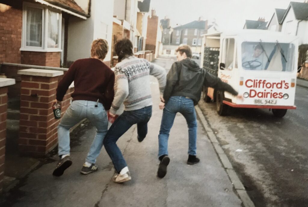
Tarquinius W. Peterson & Friends, Raymond Road, Maidenhead, Circa 1987

During a four-year study period at the renowned, now defunct (thanks to the PM), school of art, Tarquinius W. Peterson (that’s me) studied loads. Voluminous volumes read on art history, art theory, and art direction. Theorised art on a shoestring, art by numbers and Art Garfunkel. Discussions concerned with art debate and the art establishment (wherein I now take a place, a deserved place earned through toil and dedication).

Countless tomes of literature and art picture books, examined, studied, reexamined and restudied. In the showers of colour reproductions of the great master artist’s work, I found solace. Not in comic art of Jamie Hewlett or Peter Gross, that came later.

My paperback copy of E.H. Gombrich’s (1972: 1982 fourth impression, 13th edition) The Story of Art, a great foundational book covering art from its beginnings to present day. Present day being 1982 mind you, but sufficed for my needs. Plus, Dr Ernst’s title is smart too, a blatant play on words “The Story (of Art)” vs. “History (of Art)“, brilliant, huh!

Harold Osbourne’s (1970: 1981 Book Club Associates edition) “The Oxford Companion to Art“, is snug in my possession. This hardback is a dictionary-slash-encyclopaedic book. Harold didn’t write every individual word, but he was the editor chap. Such an important and prestigious position allowed last dibs on what did or didn’t go in the final published edition. In my book, excuse the pun, that’s tantamount to writing the entries himself.

The companion existed before the Gombrich, printed in 1981, but if I’m honest, I could update both these literary works with flare. My personal savoir faire from early eighties to present day transposed in the manner and eloquence of both aforementioned authors, can solve the trick. (Note to self, get my agent, Vincent, to poke around at Phaidon and OUP, proposal for writing updated versions of the discussed.)

With successful collation of unknown, but researched facts, vast comprehension in art-world-ways, and legit insider dealing, I seek to combine fine literary collections of the world. Such as auction house archives, art dealers’ back catalogues, Blue Peter annuals, art & history museum pamphlets, and completed school discovery quiz sheets.

My aim: to offer a loquacious, flowing blog of art knowledge to the web readers of the world and collective art-spiders thereabouts!

If the watery blue pictures of Hockney’s, or the darker canvases of that Rothko guy, hang on your wall. Or you enjoy those textured frames with curvy twiddles, hand-finished in real gold-leaf. With portraits of royals, or landscapes and scenery in them, a Turner or that policeman fella, Constable, that’s it. Then join with us, me! Join me on a journey through Tarquinius W. Peterson’s Fantastical Guide to the World of Art.

Every week I’ll be introducing you to a new piece of art and giving in-depth analysis. Showing who, what, when, where, why and who, I mean how (I always get those spellings mixed up), how these creations befell formulation and realisation, both in construct and construction.

Join me then, Tarquinius W. Peterson, on my colourful voyage into, umm, colours and reasons … reasons and wherefores of artisticular enjoyment in art and sculptor. Sculptor the 3D branch of art utilising different mediums (and I don’t mean clairvoyants, or, between bigs and smalls). Medium choices are materials or forms used by an artist, composer, or writer, but I’ve no interest in writing, because that’s pencilling articles and not arting pencilicles, right!

It’s a core attribute of an artist to compose successful compositions, or arrange balanced arrangements. Although, when composers compose and arrangers arrange, whilst noting musical notes with pencils on rules pencilled with rulers, is too an art form.

Art, music, and literature are affiliates of “The Arts” (along with dance … and film … oh, and computer games), but only art is art for art’s sake. Getting it “down” on paper or canvas with crayons or paint, or by utilising other artistic ingredients (but not those in the art of cooking) is art (or maybe those too). So, it’s unlikely that I’ll blog music, books or dance in my weekly art-bloggings because they are not the pure form. Unless I want to explore Performance Art, which I may undertake one week, because that’s the crazy blogger T.W. Peterson is, full of surprise!

By now you’re no doubt foaming at the tonsils with thoughts of Tarquinius W. Peterson’s Fantastical Guide to the World of Art, awesome, but wait! In one week I unleash the first edition of the Guide on the public. The reason for delay isn’t that it’s not written yet, nor that I’m organised beyond promotion having written, collated, and backed-up the entire guide somewhere in Russia. Whereupon a computer programme will submit at regular intervals. No! Neither of the above is true. You are in total suspense!

Remember those long awaited fifteen-second countdowns on Netflix between episodes of Breaking Bad or GoT when you binge-watched mid-week, well, it’s a similar proposal. Instead of seconds it will be one whole week, or thereabouts, or less, or to keep you chewing your top lip in anticipation, it will be longer.

Three words spell art, they are:

  • Anticipation
  • Resuscitation
  • Tantalisation

You might not agree in that order, however, T.W.P. knows the order, because other spellings are sticky tar or dirty rat, or rta, and being initials similar to NRA, we don’t want to get sticky or dirty, do we?

We’ll discuss more A.R.T. later.

Don’t know Degas’ Sunflowers from Van Gogh’s? Get aroused with Lucas’s Fried Eggs (no relation), or unclear as to Hirst’s Formaldehydes? Then stop-off at this WordPress. Educate your inner innovative side with artistic enlightenment, guaranteed for every persuasion of art-loving being.

Our first exploration into the art mart is this little beauty …

Nighthawks

Nighthawks by Dennis Hopper 1942

Next week, we will explore more of this piece. A right moody canvas painted by American actor Dennis Hopper in 1942. I know, I didn’t realise he painted either, and this artwork is old so he must be knocking on a smidge by now. We’ll ask questions. Who are these people? Why is there no door? This level of detail, and answers, are the usual in-depth and extraordinary knowledge you’ll receive from Mr Peterson’s Guide. Be sure to drop in soon.

Bookmark, or follow me, and let’s get arted!

Tarquinius W. Peterson’s Fantastical Guide to the World of Art, coming soon to a touch screen near you!

© 2024 M. E. Lucas

Theme by Anders NorénUp ↑